
April 13, 2026
X-Research
4399
The Aesthetic of Chaos: Understanding First
North Africa's streets aren't "badly designed" they're visual archives of survival. Flyers layered on broken walls, neon signs clashing with hand-painted type, shop banners screaming louder than the next. Hidden in the ugly is a lesson: design here doesn't beg for order, it thrives on contradiction. It's raw, improvised, sometimes painful to look at but it's alive. To understand this chaos is to respect it. To respect it is to learn from it. And to learn from it is to build something new, without erasing where it came from.
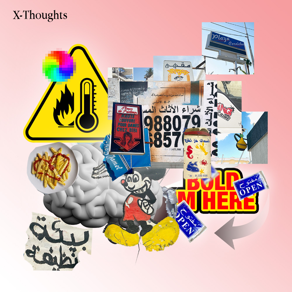
Street design in North Africa is a symphony of high-volume aesthetics. It is loud, messy, and intentionally overloaded—a collage of multiple fonts, clashing colors, and defiant misalignments. While an outsider might dismiss this as 'ugly,' we recognize it as the ultimate form of survival design. It is a visual language born from the streets: fast, cheap, and undeniably visible. It doesn't ask for permission to exist; it demands to be seen in the chaos of the marketplace
Behind every 'bad' design lies a hidden archive of human experience. It is never just a lack of polish; it is a tapestry woven from ambition, survival, humor, and local taste. For the modern creative, these visual outliers aren't mistakes they are raw research. This 'visual noise' serves as a mirror, reflecting the true pulse of society and its shifting priorities. When we look past the surface, we find the answers to how people truly define beauty in their everyday lives
The logic is uncompromising and absolute: big fonts, bright colors, and maximum visibility. In the vibrating pulse of North African markets and saturated streets, the quiet elegance of 'clarity' is a ghost. It loses every time to the power of noise. In this environment, 'white space' is a luxury that signals absence rather than sophistication. Here, design is a weapon of presence; if you are not shouting, you are invisible. This is not a failure of aesthetic—it is a strategic adaptation to a world that never stops moving, never stops selling, and never stops screaming.
"In the streets of Tunis, Casablanca, or Algiers, colors don't live in the safety of a pastel dream. They are hot pinks, cheap golds, and dusty reds. These aren't just aesthetic choices; they are a defensive strategy. These pigments are chosen because they survive the heat, resist the dirt, and remain legible through the degradation of photocopying. True design research isn't found on a digital moodboard; it’s found in the grit. You must build your palette from the reality of durability, not just the fantasy of a screen. Design for conditions, not for portfolios
When the state retreats from the visual landscape, the people occupy the void. When governments fail to invest in the civic skin—signage, cultural landmarks, or transport identity—the public doesn't wait for permission; they fill the gap themselves. But without the scaffolding of formal education or centralized standards, traditional design systems don't just bend—they collapse. Chaos becomes the default setting. This is design in its most primal, unmediated state: a grassroots response to institutional silence,
The solution isn't to sanitize our streets or erase 'ugly' design, but to find the equilibrium within it. We must respect the precision of trained designers while investing in a new era of education that understands the local pulse. Real progress happens when we collaborate directly with communities, using their 'survival design' as raw material. We don't need to suppress the chaos; we need to build robust frameworks that elevate this energy into a lasting, sophisticated cultural identity. It is about turning visual noise into a coherent, powerful voice.
Share Article
Facebook
Twitter
LinkedIn
Read more
Global Visual Homogenization
April 14, 2026
The Aesthetic of Chaos: Understanding First
April 13, 2026
North African Schoolbooks: Between Noise and Clarity.
April 13, 2026
Tagged journal