The Aesthetic of Chaos: Bags of Meaning
Most impactful everyday designs rely on the raw constraint of just one or two unapologetic colors, actively rejecting the weak, sterile gradients of digital perfection in favor of clear, heavy shapes and screaming, undeniable contrast. To build a visual presence that actually commands attention in a desaturated world, you must anchor your work in a single dominant hue and construct it with solid, forceful forms that leave absolutely no room for hesitation. When it comes to texture, we must completely forget the frictionless polish of modern software; instead, we inject a raw, analog noise or physically print one dense layer of ink over another, deliberately honoring the visceral bleed and authentic imperfections of traditional silkscreen and risograph printing. At xtra studio, this methodology is our foundational blueprint: we embrace these tactile, high-contrast techniques not as limitations, but as necessary weapons to shatter the digital void, proving that the most enduring design is always fiercely tangible, rooted in the improvised grit of the streets, and built with enough unapologetic volume to permanently cut through the endless grey noise of lazy minimalism
Most impactful designs rely on just one or two unapologetic colors, rejecting sterile digital gradients for heavy shapes and screaming contrast. To build real presence, anchor your work in a single dominant hue. For texture, skip the software polish—layer analog noise or physically overprint dense inks to honor the raw imperfections of silkscreen and risograph. At xtra studio, we embrace these high-contrast, tactile constraints to shatter the digital void, proving that true design is always raw, tangible, and built to cut through the endless grey of lazy minimalism.
Take a close look at the everyday plastic bag, the ultimate artifact of creative capitalism. The vast majority of these bags start their lives as mindless stock templates—a ubiquitous "Thank You," a lazy starburst, a scatter of generic icons—before a local logo and phone number are just carelessly thrown on top. It is a system engineered to be modular, fast, and ruthlessly effective for commerce. But if you truly study this underlying template logic, it explains exactly why modern visual culture so often feels like a repetitive wasteland of copy-paste convenience. At xtra studio, we actively reject this mechanized, disposable approach; we draw inspiration from the raw, improvised street visuals of North Africa, treating them as true archives of survival rather than "bad design," and we absolutely refuse to let our work become just another generic layer slapped onto a pre-made world.
Local plastic bags are far more than disposable vessels; they are the everyday posters of the streets. They carry the unfiltered, urgent voices of our local markets—fast, loud, and unapologetically raw. To the untrained eye, their chaotic layouts might look like bad design, but they are actually vital, improvised visual archives of survival that capture the true pulse of the city. Before this hyper-local language is entirely erased by sterile modernization, it demands to be deliberately photographed, studied, and preserved. At xtra studio, we do not dismiss the grit of the streets; we elevate it, absorbing the unapologetic energy of North Africa's urban environments into our work to ensure our designs never lose their authentic, human edge.
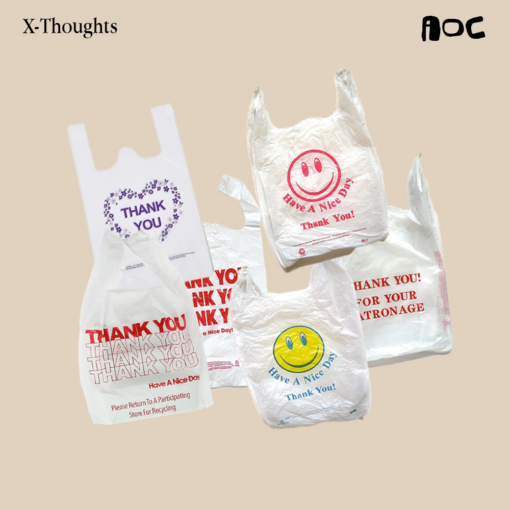
Take the ubiquitous plastic deli bag—a quick, no-frills collision of a simple smiley face paired with a bold, repetitive "Thank You"—which first flooded New York bodegas before bleeding through wholesale supply chains to become a massive, global visual anchor. What began as the most generic, disposable packaging imaginable organically morphed into an undeniable cultural signifier, powered by the raw charm of cheap, bleeding ink, heavy utilitarian typography, and an unapologetic display of visible gratitude. This bag is the ultimate proof that fast, unpolished design isn't inherently "bad"; sometimes, when a visual is truly rooted in the everyday hustle, it bypasses the pretentious rules of modern branding and permanently sticks to the culture. At xtra studio, we look at these iconic artifacts not as cheap clutter, but as a masterclass in authentic, street-level communication. We draw our energy from this exact kind of raw, improvised impact, knowing that the most powerful design is never sterile or over-engineered, but built to speak the loud, unfiltered language of the real world.
While the much-needed ecological death of the plastic bag is a crucial victory for the earth, its total erasure threatens to wipe out an irreplaceable, raw chapter of our visual culture. The global shift away from harmful, disposable materials is undeniably a step forward, yet the distinct visual language etched onto them—the chaotic typography, the utilitarian symbols, the urgent and unpolished voice—still fundamentally matters to anyone paying attention. At xtra studio, we believe that discarding a toxic medium should never mean discarding its cultural footprint; instead, we must actively save this improvised aesthetic, study its unapologetic grip on everyday life, and deliberately treat it as a vital design reference for the future. By archiving the street-level grit of the past, we ensure that as our physical materials finally become more conscious, our creative output refuses to lose its unapologetic edge.
Kitsch often gets dismissed as bad taste. But in cultures like ours, kitsch is a powerful emotional connector. Those glitter roses and neon gradients aren’t mistakes — they’re nostalgia triggers. They carry the visual DNA of celebration, the memory of every wedding we’ve ever attended. Kitsch has emotional authority. It disarms the intellect and speaks directly to memory. That’s why it works — it feels familiar, festive, and comforting. It’s not anti-design. It’s folk design.
At first glance, these invitations seem chaotic. But look closer and you’ll start to see the system. What appears random is actually a visual dictionary — an informal but precise design language everyone understands instinctively. Once decoded, these elements can be remixed: reinterpreted into editorial design, experimental collages, or modern branding that honors its roots.
The chaos isn’t meaningless — it’s coded culture waiting to be translated.
Behind every ornate invitation lies a family design board — a real-life focus group of mothers, cousins, and in-laws.
Each relative adds feedback: “Make the gold brighter.” “Add more roses.” “The font should look richer.” The process can go through a dozen revisions before approval. It’s design under pressure — not from clients, but from legacy, pride, and emotion. In this system, aesthetics become negotiation. The final card isn’t just a design — it’s a family compromise made visual.