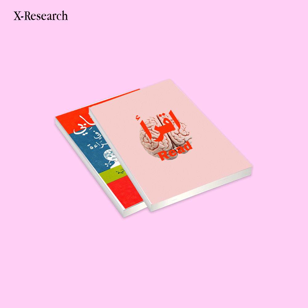
North African Schoolbooks: Between Noise and Clarity.
Our first design lessons came from schoolbooks, crowded, chaotic, and messy. If design starts at 6, then clarity and consistency should be non-negotiable.
This research is about making things clear and building a solid strategy: schoolbooks matter more than anything, because changing them can change everything.
Before art school or Behance, your eyes were
trained by a science book with pixelated vegetables
or a language notebook with stretched Arabic fonts.
You didn't know it yet, but design was already
shaping your taste, instincts, and attention span.
If a drawing is inaccurate, or if colors are confusing,
a child learns the wrong thing .Good design gives
structure to thought. Bad design builds chaos.
At that age, clarity is everything.
Older schoolbooks had balance, studied layouts,
limited colors, real designers behind them.
Now? Clashing palettes, kitchy clipart, and chaos
on every page. It's not education, it's noise and
kids learn confusion before knowledge.
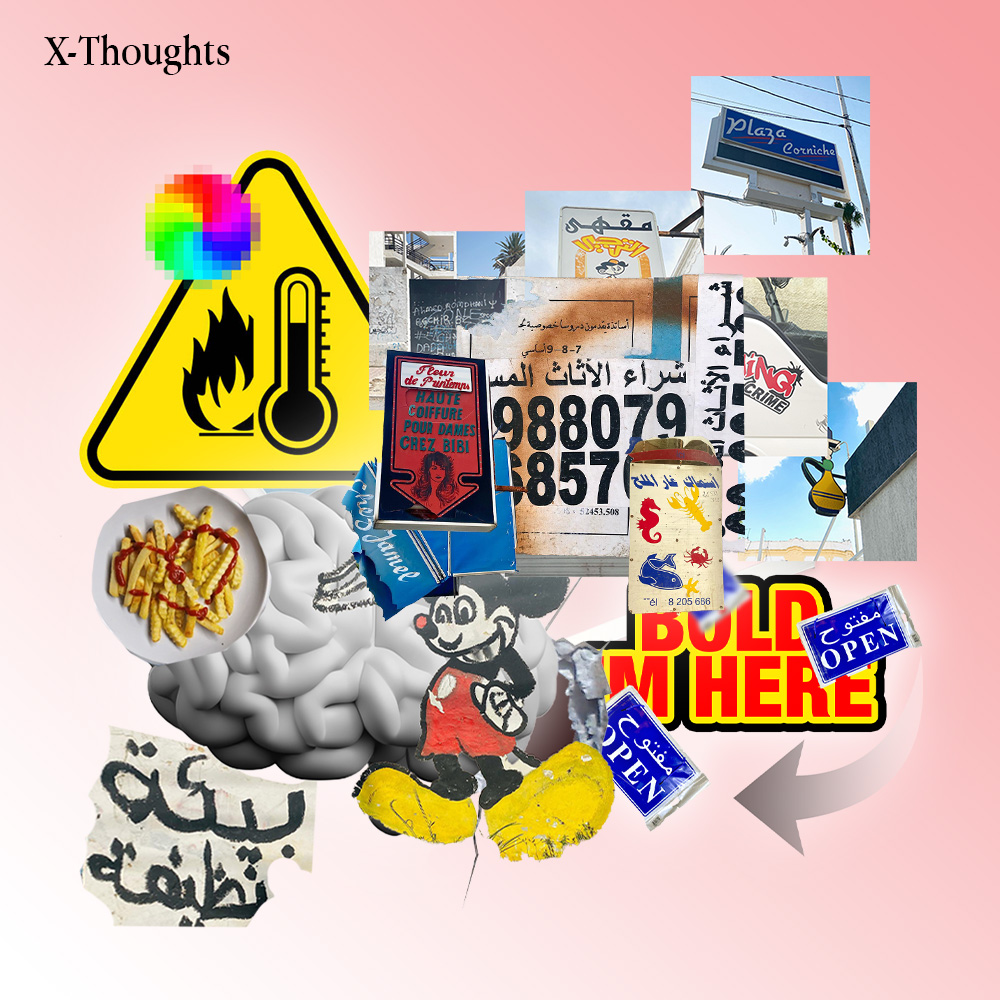
When our schoolbooks use European templates,
white cartoon kids, or imported icons, they tell us:
"You don't belong here." We need illustrations of
our names, our faces, our streets, our realities.
Representation starts with line art.
Those schoolbags aren't even official merchandise,
just generic imports from China. It ends up as free
marketing for big companies like Disney, while
ignoring local culture. Clashing visuals with no room
to breathe and yet childhood surroundings like these
shape our visual taste early on. What if school
materials were reimagined with calm, minimal,
and culturally rooted design instead?
We grew up with floating clipart pencils, shadows under everything, and five fonts on one cover. It wasn't elegance, it was urgency. Today, these survival aesthetics now inspire modern anti-design, bootleg style, and glitch culture.
Design isn't decoration, it's part of how we learn.
When a schoolbook cover feels poorly made or
outdated, or when pages are cluttered and hard to
follow, kids disconnect before the lesson even
begins.
In the West, design for children is a billion-euro
industry: color psychology, layout studies, font
testing. In the Global South, it's often an afterthought
handled by printers, not designers. This is how
structural inequality starts at age six.
Behind every ornate invitation lies a family design board a real-life focus group of mothers, cousins, and in-laws.
Each relative adds feedback: “Make the gold brighter.” “Add more roses.” “The font should look richer.” The process can go through a dozen revisions before approval. It’s design under pressure not from clients, but from legacy, pride, and emotion. In this system, aesthetics become negotiation. The final card isn’t just a design it’s a family compromise made visual.