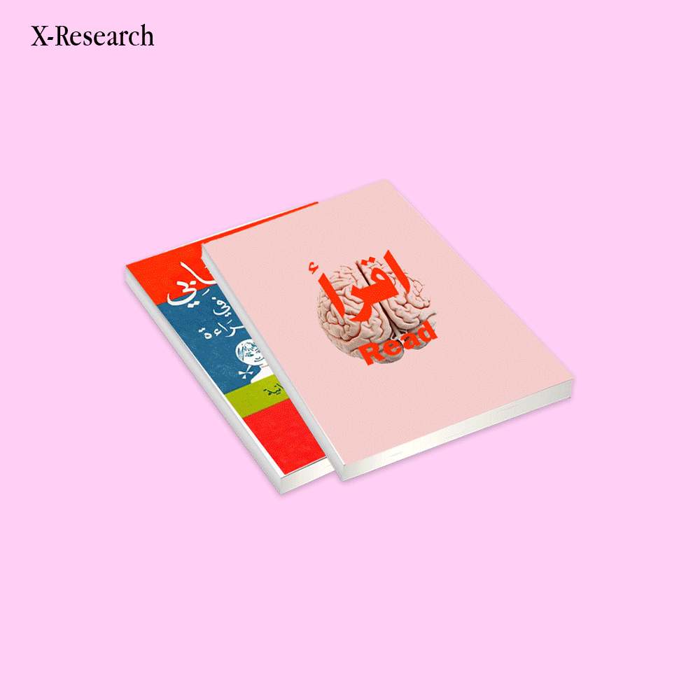
Global Visual Homogenization
In 2020, a study of over 7,000 historical objects confirmed a stark reality: over two centuries, color has quietly bled out of the things we make. What began as a pursuit of industrial efficiency mutated into a sterile aesthetic ideology, where endless greys and "timeless" neutrals were falsely crowned as modern, and lazy minimalism was mistaken for good taste. But our eyes are starving. This forced, grey uniformity doesn't just lack character; it actively dulls our stimulation and flattens our mood, leaving a quiet hunger for visual energy we barely even register anymore. At xtra studio, we know the next true creative rebellion isn't about achieving frictionless, desaturated perfection. It is about rejecting the void and unapologetically bringing the life, texture, and vivid color back in.
A study of the UK Science Museum's collection reveals a quiet but undeniable trend: across two centuries of human objects—from early telegraphs to mid-century toasters—the saturation knob has been steadily turned down. Where our tools once sparked with vibrant enamels and unapologetic pigments, they have slowly surrendered to a sterile sea of brushed aluminum, matte black, and safe, homogenous greys. As technology grew smarter, our physical world became muted, trading bold character for invisible, mass-produced nothingness. At xtra studio, we refuse to fade into this default grayscale; we are here to reach for that dial, grip it tight, and crank the saturation back up.
Our brains were simply not built to inhabit the void. Researchers increasingly suggest that this modern lack of visual stimulation is actively contributing to a collective "flattening" of our daily mood and energy. In our relentless pursuit of minimalist perfection, we are literally starving our eyes just to feed a sterile, manufactured aesthetic. At xtra studio, we recognize that vivid, impactful design is a biological necessity rather than an afterthought; we are here to break the monochrome monotony and create work that feeds the senses instead of draining them
We somehow convinced ourselves that "neutral" automatically meant premium, mistaking a lack of character for elevated taste. In the pursuit of commercial safety, we systematically stripped away all raw personality to ensure longevity, ultimately building a standardized design language rooted entirely in the fear of being outdated. At xtra studio, we know that hiding behind lazy minimalism only guarantees you will be forgotten; we build visual identities driven by unapologetic authenticity, proving that true creative impact outlasts any safe, desaturated trend.
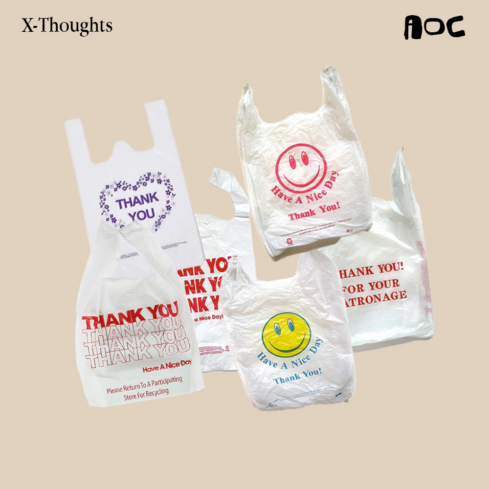
By 2020, "Grey" became the undisputed, dominant color of consumer goods, marking the absolute peak of a curve where our world was ruthlessly optimized for seamless, frictionless, and utterly unchallenging integration. We traded authentic visual expression for the mass-produced safety of creative capitalism, burying our physical spaces under the crushing weight of lazy minimalism. At xtra studio, we recognize this great desaturation for exactly what it is: a surrender. We are here to disrupt this frictionless void, rejecting the copy-paste templates of a grey world to reclaim the raw, vivid, and unapologetic energy of true design.
Technology actively reinforced this visual drift, crowning brushed aluminum, matte black, and gloss white as the mandatory uniforms of our supposedly advanced future. We willingly allowed our physical hardware to become entirely invisible, erasing its tactile soul just so the glowing screens of software could shine. At xtra studio, we refuse to let physical form play second fiddle to a digital illusion; we design with a raw, unapologetic energy that demands to be seen, pulling the tangible world out of the shadows and reminding people that real impact isn't meant to be invisible.
If the default setting of our modern world has been aggressively desaturated, then wielding color is no longer just an aesthetic choice—it is a vital act of rebellion. In a landscape dominated by safe, invisible design, choosing to be vivid is a radical reclaiming of raw human emotion against the numbness of creative capitalism. At xtra studio, we do not use color simply to decorate; we use it as a deliberate strike against the silence, injecting unapologetic life back into a system that desperately wants us to fade away quietly.