UNIT+VISION
UNIT+VISIONU+VYear : 2026Categories : Brand IdentityDimensions: Various
UNIT+VISIONU+VYear : 2026Categories : Brand IdentityDimensions: Various
Most impactful everyday designs rely on the raw constraint of just one or two unapologetic colors, actively rejecting the weak, sterile gradients of digital perfection in favor of clear, heavy shapes and screaming, undeniable contrast. To build a visual presence that actually commands attention in a desaturated world, you must anchor your work in a single dominant hue and construct it with solid, forceful forms that leave absolutely no room for hesitation. When it comes to texture, we must completely forget the frictionless polish of modern software; instead, we inject a raw, analog noise or physically print one dense layer of ink over another, deliberately honoring the visceral bleed and authentic imperfections of traditional silkscreen and risograph printing. At xtra studio, this methodology is our foundational blueprint: we embrace these tactile, high-contrast techniques not as limitations, but as necessary weapons to shatter the digital void, proving that the most enduring design is always fiercely tangible, rooted in the improvised grit of the streets, and built with enough unapologetic volume to permanently cut through the endless grey noise of lazy minimalism
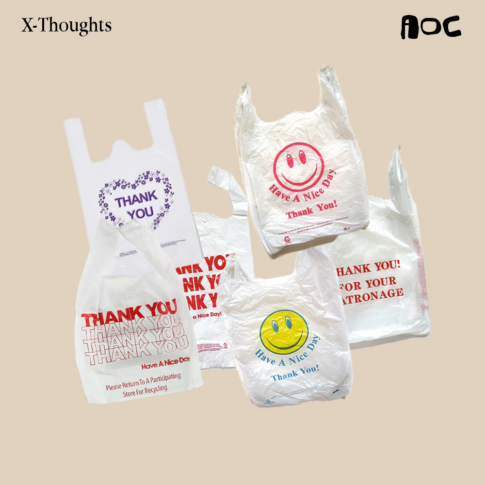
In 2020, a study of over 7,000 historical objects confirmed a stark reality: over two centuries, color has quietly bled out of the things we make. What began as a pursuit of industrial efficiency mutated into a sterile aesthetic ideology, where endless greys and “timeless” neutrals were falsely crowned as modern, and lazy minimalism was mistaken for good taste. But our eyes are starving. This forced, grey uniformity doesn’t just lack character; it actively dulls our stimulation and flattens our mood, leaving a quiet hunger for visual energy we barely even register anymore. At xtra studio, we know the next true creative rebellion isn’t about achieving frictionless, desaturated perfection. It is about rejecting the void and unapologetically bringing the life, texture, and vivid color back in.
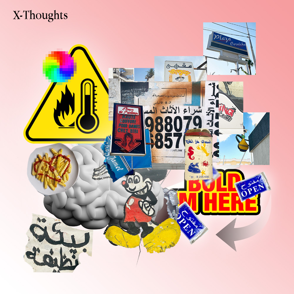
North Africa’s streets aren’t “badly designed” they’re visual archives of survival. Flyers layered on broken walls, neon signs clashing with hand-painted type, shop banners screaming louder than the next.
Hidden in the ugly is a lesson: design here doesn’t beg for order, it thrives on contradiction. It’s raw, improvised, sometimes painful to look at but it’s alive.
To understand this chaos is to respect it. To respect it is to learn from it. And to learn from it is to build something new, without erasing where it came from.
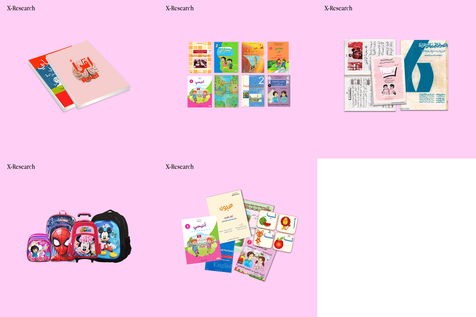
Our first design lessons came from schoolbooks, crowded, chaotic, and messy. If design starts at 6, then clarity and consistency should be non-negotiable.
This research is about making things clear and building a solid strategy: schoolbooks matter more than anything, because changing them can change everything.
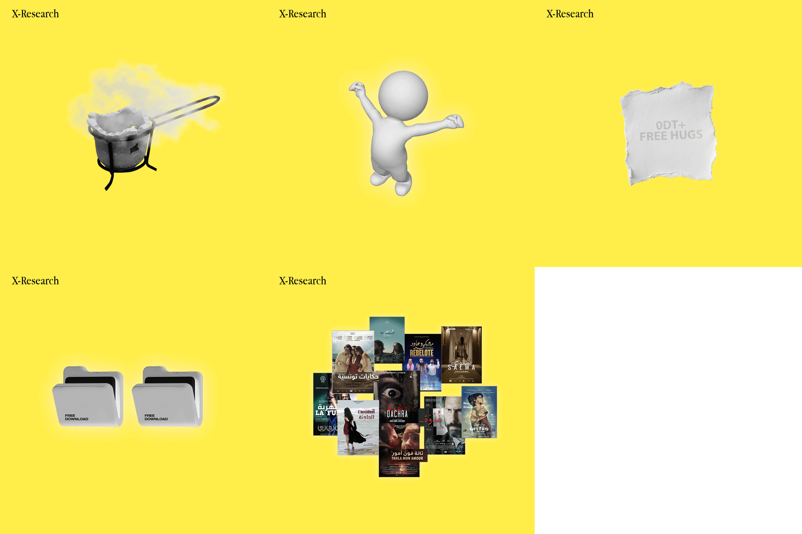
Tunisian cinema has stories worth telling, but the posters too often fail them. Same fonts, same layouts, rushed stills from the film slapped on at the last minute. Low budgets, lack of design knowledge, and a culture that sees posters as secondary all add up to visuals that don’t match the power of the films themselves.
This series is a reflection on that problem: honest critique, raw observations, and reminders of how important poster design is in shaping an entire industry. Because a poster isn’t decoration, it’s the first spark that can make cinema explode beyond its screen.
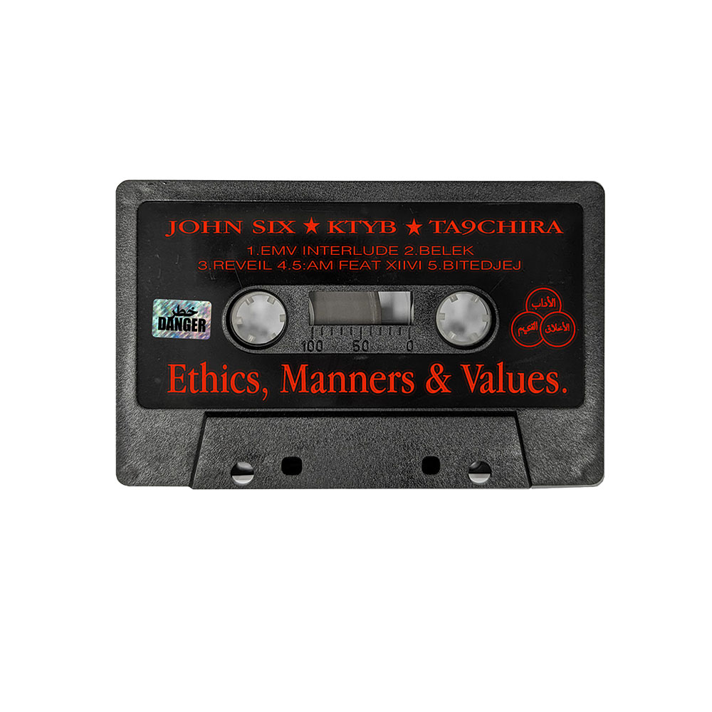
E.M.V Music AlbumYear : 2026Categories : Album CoBrand IdentityDimensions: Various
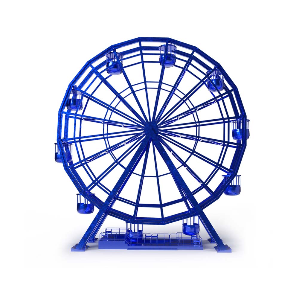
AAP5 Minassa (INCO Group)Year : 2023Categories : Brand IdentityDimensions: Various Not every application needs to feel like a job interview. For Minassa’s cultural incubator call, we turned the campaign into an amusement park playful, inviting, and slightly unexpected. The idea was simple: remove the pressure, keep the curiosity, and make “submit” feel less like a […]
Runs on Harissa Fichier Caché x LamiriYear : 2025Categories : Brand IdentityDimensions: Various
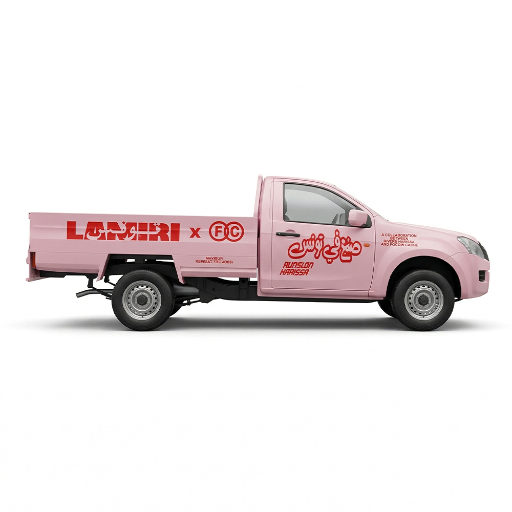
The project began with a simple question: how can we translate the essence of Harissa, its spice, its labor, its cultural weight, into design? with Fichier Caché and Lamiri Harissa we explored Tunisia’s visual and emotional relationship with this staple, tracing its journey from local farms to kitchen tables.
The truck became our central symbol, that humble machine connecting land, labor, and culture. From there, we developed the full creative direction: concept, art direction, branding, merchandise, and production. We transformed the truck into a moving icon, a bold pink vehicle, fully branded from top to bottom, carrying Harissa cans, stickers, air fresheners, and t-shirts.
For marketing, we brought the concept to life, literally. We built the real truck, turned it into a mobile installation, and shot the campaign across Tunisia. Even after the activation, the truck remained on the road, still branded, offering ongoing visibility long after the campaign ended.