Why North African wedding invitations hurt your eyes ?
Weddings in Tunisia are not quiet affairs. They’re social theatre a public declaration of pride, legacy, and hierarchy. Every gesture is coded, every detail symbolic. And the very first scene of this performance? The wedding invitation.
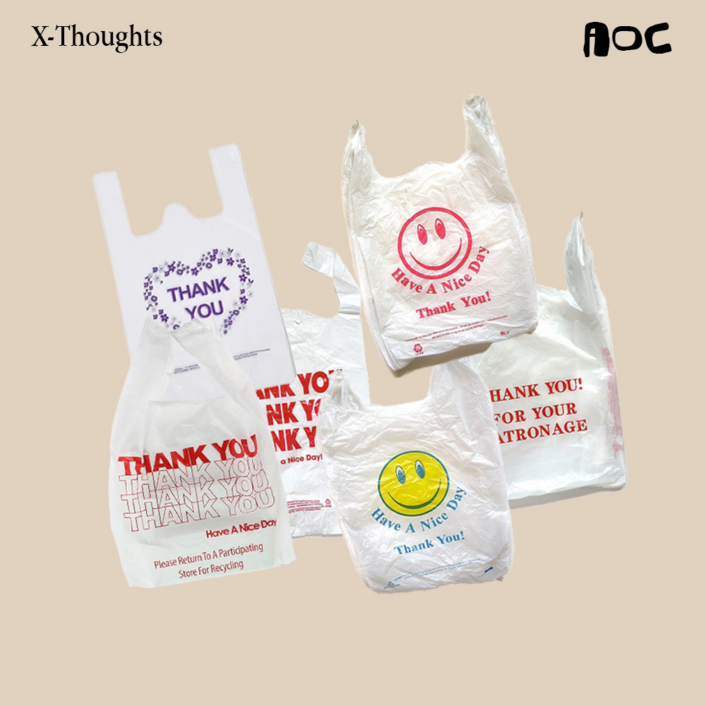
Gold foil. Embossed borders. Script fonts so curly you can barely read the names. Glitter that ends up everywhere. These are not just decorations — they’re visual signals of success, taste, and family power. What looks “ugly” to a designer’s eye is, in truth, a reflection of cultural psychology: the need to show, to celebrate, to perform status. In Tunisia, the wedding invitation is the trailer of the film — an object meant to impress, not to simplify.
Foil stamping, embossing, glitter ink — these aren’t random printing techniques. They’re the visual language of prestige. In Tunisia, the heavier the paper and the shinier the ink, the more successful the family appears. Printing is no longer about information — it’s a competitive sport. The tactile richness of the paper becomes a stand-in for social credibility. What Western minimalism calls “too much,” Tunisian families call quality. The production process becomes a form of storytelling: the shimmer of foil says, We invested in this moment. We matter.
Forget legibility. Forget hierarchy. These invitations are not meant to be clean — they’re meant to be memorable. The goal isn’t to inform; it’s to stun. Script fonts tangle across gradients, roses bloom over gold textures, borders overlap like frames from a dream. It’s visual drama as a statement of love and legacy. In the West, design often tries to disappear — here, it tries to perform. Function is irrelevant when the point is to make a whole neighborhood talk.
Gold doesn’t just shimmer — it speaks. Across North Africa, gold is a cultural code for wealth, continuity, and security. When it appears on wedding cards, it carries ancestral weight: the idea that marriage is not just a romantic bond but a continuation of family history. To include gold foil isn’t superficial — it’s symbolic, representing blessings, inheritance, and honor. So when families insist on gold, they’re not making an aesthetic decision; they’re writing their lineage into print.
The Invitation as Cinema Trailer The wedding card doesn’t just announce a date — it builds anticipation. Like a movie trailer, it sets the tone, introduces the atmosphere, and promises a grand spectacle. You can almost hear the soundtrack when you hold it. Every glitter rose, every laser-cut border, every flourish of calligraphy exists to hype the “main event.” The invite doesn’t simply invite — it markets the wedding. It’s emotional pre-production.
Minimalism is often sold as “universal good taste.” But in Tunisia, ornamentation is the design language. Floral borders, pearls, ribbons, embossed corners — they’re not clutter, they’re rhythm. They give the piece energy, life, and movement. Ornamentation is celebration. This is a culture where abundance equals beauty — where excess signals joy. To design for this audience is to understand that restraint can sometimes read as emptiness. Maximalism here isn’t noise; it’s authenticity.
When a Tunisian family approves a wedding design, they’re not looking for balance or negative space. They’re looking for prestige. The question isn’t “is it beautiful?” It’s “does it look rich?” Typography, layout, and color harmony are secondary to the reaction the invitation will provoke when shown around. This is design as performance art — made to elicit gasps, not applause from a design jury.
Kitsch often gets dismissed as bad taste. But in cultures like ours, kitsch is a powerful emotional connector. Those glitter roses and neon gradients aren’t mistakes — they’re nostalgia triggers. They carry the visual DNA of celebration, the memory of every wedding we’ve ever attended. Kitsch has emotional authority. It disarms the intellect and speaks directly to memory. That’s why it works — it feels familiar, festive, and comforting. It’s not anti-design. It’s folk design.
At first glance, these invitations seem chaotic. But look closer and you’ll start to see the system. What appears random is actually a visual dictionary — an informal but precise design language everyone understands instinctively. Once decoded, these elements can be remixed: reinterpreted into editorial design, experimental collages, or modern branding that honors its roots.
The chaos isn’t meaningless — it’s coded culture waiting to be translated.
Behind every ornate invitation lies a family design board — a real-life focus group of mothers, cousins, and in-laws.
Each relative adds feedback: “Make the gold brighter.” “Add more roses.” “The font should look richer.” The process can go through a dozen revisions before approval. It’s design under pressure — not from clients, but from legacy, pride, and emotion. In this system, aesthetics become negotiation. The final card isn’t just a design — it’s a family compromise made visual.